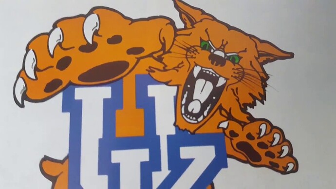
Um…wat?
Just look at it and then you won’t unsee it. The “teeth” are beaks. Same school that did Penis tongue logo:
lol. These are hilarious and you are right - once you see it, you can’t unsee it.
That’s not a bad athletics logo with a little extra detailing. The interlocking U is bad. Therefore, not slander.
So pro crow sex and wildcat penis tongue but anti interlocking U. Agree to disagree.
CAW CAW
Hard disagree here. I’m sorry, but if you rate the boring block U above the interlocking U’s, your taste is suspect. Drum and feather will always be my favorite for sentimental reasons.
Wait, you’re suggesting that the Interlocking U design isn’t boring on top of being terrible? I think the Block U needed some development, but as a design is still light years better than the Interlocking logo. And yes, the D&F is classic.
My only gripe with Utah Tech is the name is a retread. Utah Tech (Orem-Provo, Salt Lake) hung on those schools for decades before their transitions. In the case of those two earlier schools, they actually were tech schools. They taught skilled trades alongside University prep courses.
Dixie never did. It taught white-collar two year programs and university prep courses. I went JUCO to knock out my lib eds.
LOL, now I can’t unsee it.
Which is funny, as I stared at it for longer than I should have yesterday trying to see it and…nothing.
UK has a weird history of sexual logos.

Wait. I am not sure exactly what this means. Our state is negative? I mean there are certainly elements of our state that I could live without, but… negative space pays homage to the state? I guess that is why people smarter than I design this stuff.
Thank you for the explanation Rocker. Now I see it. If it is databases or music or history, I am there. Clearly, however, I know nothing about graphic design.
That negative space circle in the “d” is genius!
