This is almost as great as Utah’s interlocking U.
The excitement in Utah over this change must be palpable. I’m a little worried, though, that the “tech” in Utah Tech is closer to ITT Tech than to CalTech.
6 Likes
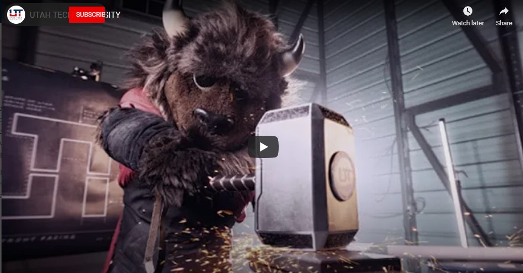
The Bison is wielding Mjölnir. No doubt he’s also pounding affordable beers and vaping in the parking lot. My guy has a sleeveless hoodie on. He’s not skipping chest and bicep day.
2 Likes
I dont know … I always thought the The Dixie Rebels was kind of cool. BTW If you are going to have a University in St. George … How can you not have the mascot be a dragon?
4 Likes
Wait wut? I always thought keeping the “Jazz” name was weird but this is so weird. I assume this was a region many descendants of Confederates lived. Like in Orange and San Bernadino County California (Where they have confederate monuments in graveyards still).
St George was always called “Utah’s Dixie” cause its the southernmost part of the state. So they were the Dixie Rebels
Brigham Young called the Southwest corner “Dixie” when they settled it due to the mild desert climate. The Mormons took a shot at growing cotton there. Up until roughly several years ago, the term “Dixie” was still being used pervasively in the travel marketing campaigns. The school came a long time later. When I attended in the 1980’s, Dixie was a two-year JUCO with a Nationally Ranked Football team, and a top tier Basketball program. It had about 1400 students at that time. St. George was a little college town at the time, too.
Fun times.
1 Like
Yeah, probably not the best name to use after 1865.
3 Likes
True, the original catalyst for the Dixie name was the climate and the region’s southern location, but the school also adopted “Rebel” as its nickname in 1952 and they adopted a confederate soldier as their mascot in 1956. By 1960 the confederate flag was flown as a school symbol until it was formally removed in the early 1990’s. I own a home in St George and am very familiar with the culture in the region. There are some strong supporters of the confederate ideology today down there that love to draw attention to themselves.
3 Likes
Apparently there are people with this ideology nationwide.
There’s no way that’s an official rendering that actually came from the school…right?
I mean, it looks like something my middle schooler would bring home as an art project they whipped up during 3rd period.
2 Likes
Kind of the point. To appeal to younger folk.
1 Like
Ooof. I guess if you like the interlocking U logo from a design standpoint, I can see how you would enjoy this.
But it looks like it was cooked up over a weekend by a mid-level high school art student using whatever replaced Microsoft Paint. The justifications for the design choices are hilarious to read though - bonus points for that. Overall, D+ at best.
3 Likes
1 Like
This is typical Utah football luck. I have PTSD going way back.
1 Like
I need to know if this one is real. I’m def in the minority that loves it most likely:
It’s real and immediately followed the original version of the interlocking U logo. It’s solid - was the basis for the revised versions of the 90s and early 2000s - it got cleaned up and bolder to be easier to see and reproduce on merchandise.
1 Like
I honestly don’t think there is a “Bad” design that you guys have other than the ones mocking native Americans but you have to go way back for that one.
History of Utah logos graded:
Interlocking U logo: earliest ‘official’ logo that I know of - looks like it was whipped up by an elementary student using Microsoft Paint, except that didn’t exist yet. Okay for the day: C-
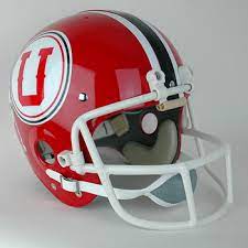
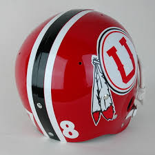
First generation drum and feather: cool concept, but culturally insensitive. Execution of the design was appropriate for the day and it looked great on helmets. Distinctive, yet derivative of the Washington football team. Better than average: B
Second generation drum and circle: simplified and bold-ed for ‘modern’ audiences. Looked great on helmets and was gaining traction in nationwide recognition, but use of the logo was reduced at the request of the Ute tribe and respectfully, understandable. Bold and clean design: A-
Block U: Super simple design that could have been a legend. Started out as just the solid U, but then gained some details including beveled edges that made it look a little more appropriate as a sports logo, but perhaps a bit too plain. Proof that Utah is “The U”: B+
Return of the Interlocking U: Hot garbage. It was barely passable in the 1970s and it is 100% unacceptable now. By far the worst logo in all of Division I sports: F-