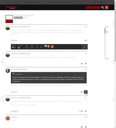
Today, the appearance of the site is different. The font for most text is a light gray on white. It’s tought to read on a monitor, and nearly impossible on a phone. I’m looking around for personal settings I can adjut, but haven’t found anything yet.
Changing to Dark mode makes it much more readable. Light or Neutral mode seem to be the problem.
I played around in Preferences/Interface, and changed from Dark to Light. Now the text is black instead of gray.
Probably user error on my part somehow.
Cached.
Same problem here
Just tried switching from Dark back to Netural and it didn’t make a difference. It was still grey text on white background, which was unreadable.
Im using Safari on my iPhone.
I’m using Safari on an iPhone, Chrome on a Windows 10 laptop, and Safari on a Mac. No problems for me on any of them using any theme, or after theme changes.
Did you guys having the problem, recently update anything?
I’m using Safari.
Changing Dark on the main menu didn’t work for me.
Go into Preferences/Interface, and changed from Dark to Light. Now the text is black instead of gray.
What I’ve seen is the U is now in a scrip like the W for Wisconsin. The UFN logo is in the same script. It is light, not dark.
One more observation. I fixed it on my laptop using the steps above, and it also fixed my phone. So it seems to be an account related setting possibly?
